Responsive Design
Multi-Device Experience
Greater User Experience
Greater Webpage Management
SEO Advantage
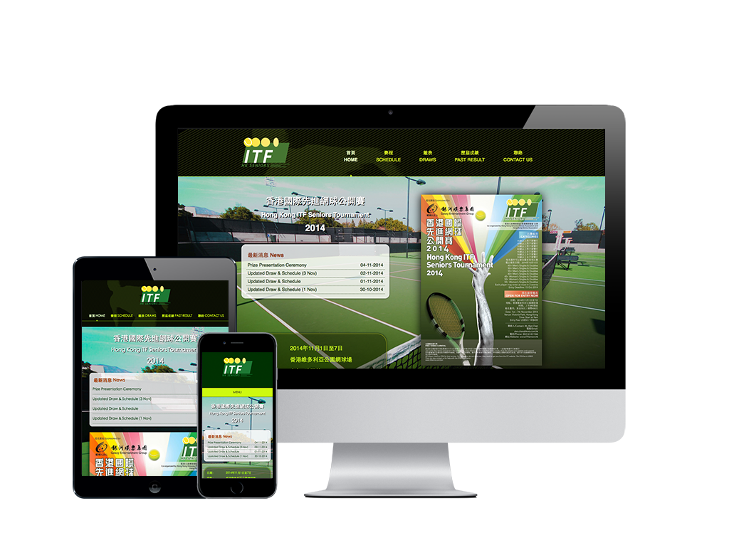
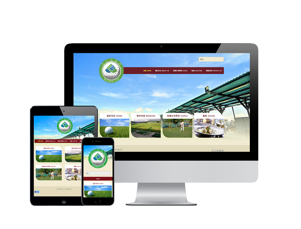
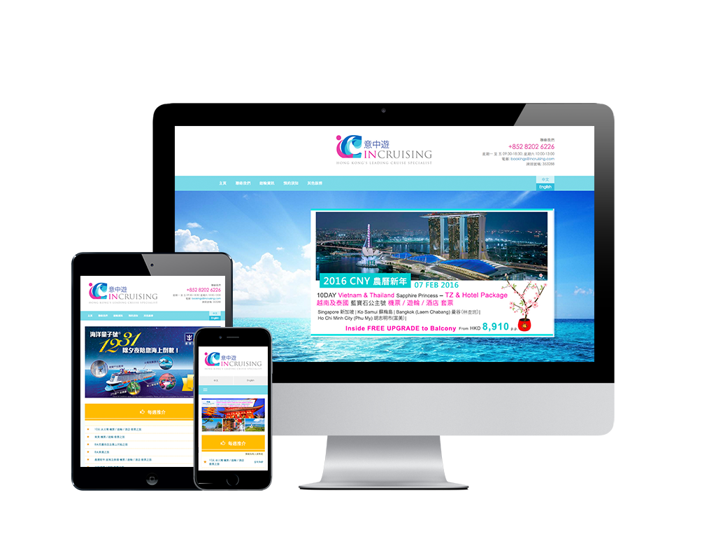
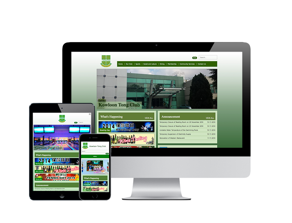
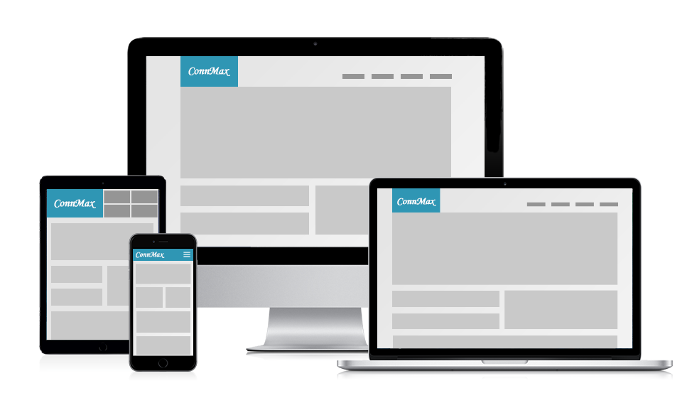
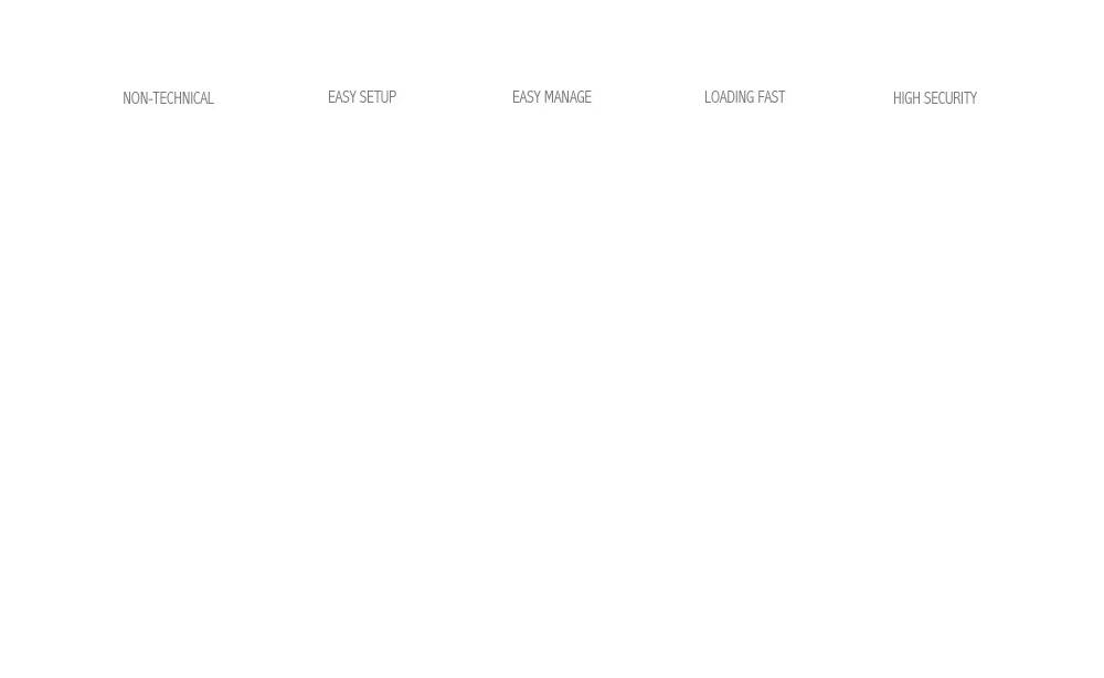
Web Design & Content Management System
Powered by Thinking Technology Limited
Wide Screen
Middle Screen
Small Screen
Single Website for Difference View
No need to worry about creating a whole new website every time a new screen-sized device is introduced into the market.
Desktop
Laptop
Tablet
Mobile
Supported Multi-Device
It’s easier to administer just one website for difference devices.
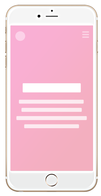
Same Experience
Mobile users will see a slightly different layout from desktop users, however by and large everyone viewing your site will get the same experience
One Website One SEO
both for desktop and mobile users, you’ll have an incredibly difficult time attracting traffic from organic search your site.
PRICING TABLE
Basic
- Tailor-Made Design Layouts Presented to The Client for Approval
- 5-pages A4 size design
- A language (English/Simplified/Traditional)
- Website hosting service for 1 year
- ConnMax CMS
HKD$ 8,000
Recommended
- Tailor-Made Design Layouts Presented to The Client for Approval
- Homepage design with maximum 3 images rotating banner
- 7-pages A4 size design
- Website Analysis
- A language (English/Simplified/Traditional)
- Website hosting service for 1 year
- ConnMax CMS
HKD$ 10,500
Advance
- Tailor-Made Design Layouts Presented to The Client for Approval
- Homepage design with maximum 4 images rotating banner
- 8-pages A4 size design
- Website Analysis
- A language (English/Simplified/Traditional)
- Basic Feedback Form x1
- Website hosting service for 1 year
- ConnMax CMS
HKD$ 13,000
Premium
- Tailor-Made Design Layouts Presented to The Client for Approval
- Homepage design with maximum 5 images rotating banner
- 12-pages A4 size design
- Website Analysis
- A language (English/Simplified/Traditional)
- Basic Feedback Form x 1
- Website hosting service for 1 year
- ConnMax CMS
HKD$ 20,000